
This looks out of whack at the rich end of the scale. However, note that those 2 groups represent a range of $50k/year or more (i.e. $200k-250k, and $250k and up, respectively). All other groups represent a range of only $5k (e.g. $75k-80k). If the far right groups were broken into the same $5k intervals as all the other groups, the chart would look more as expected with each successive group getting smaller and smaller.
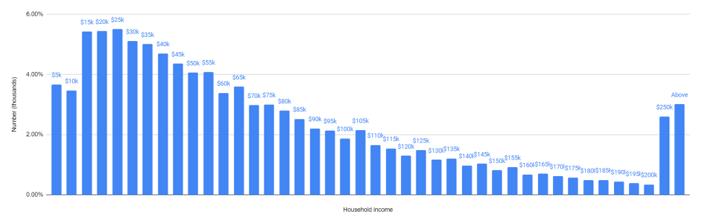
Median household income was a little under $55,000.
